
UX Design & Consulting
The Hawaii Restaurant Association represents 4,000+ local restaurants and foodservice businesses. Their website wasn't doing their organization justice. Too many broken links and disoragnized content that ruined their credbility
The Hawaii Restaurant Association
UX Design & Consulting
+10
Talking & planning
35%
Bounce Rate
+400
Members Served
What changed & why it mattered for members, sponsors, and first-time visitors.
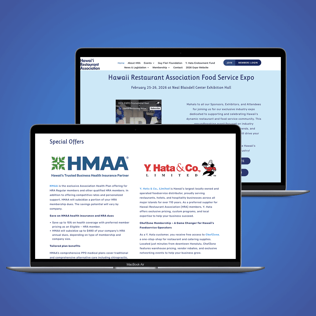
✗ Navigation links sending users off-site with no return path ✗ Content disorganized & the most important info buried ✗ Inconsistent spacing and visual hierarchy throughout ✗ Outdated design that didn't match a major advocacy org ✗ No clear prioritization of events, news, or member resources
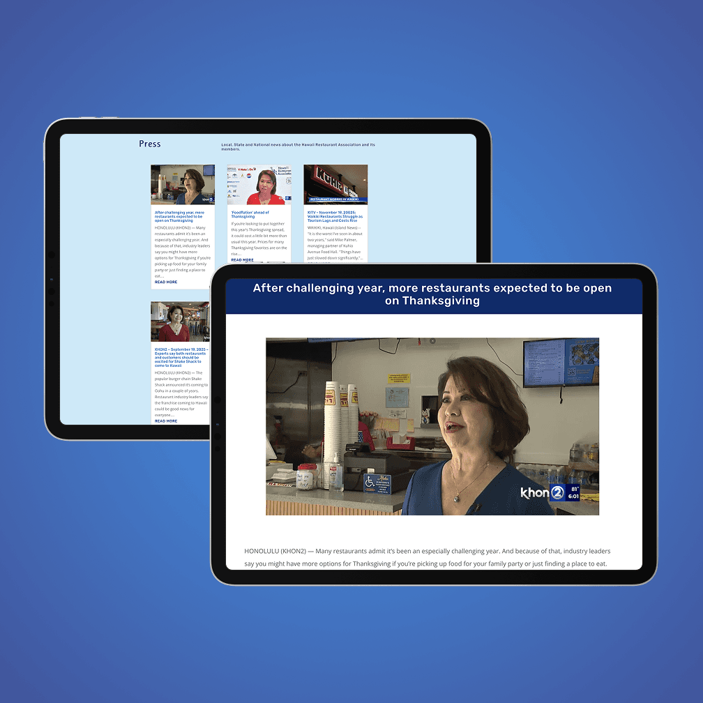
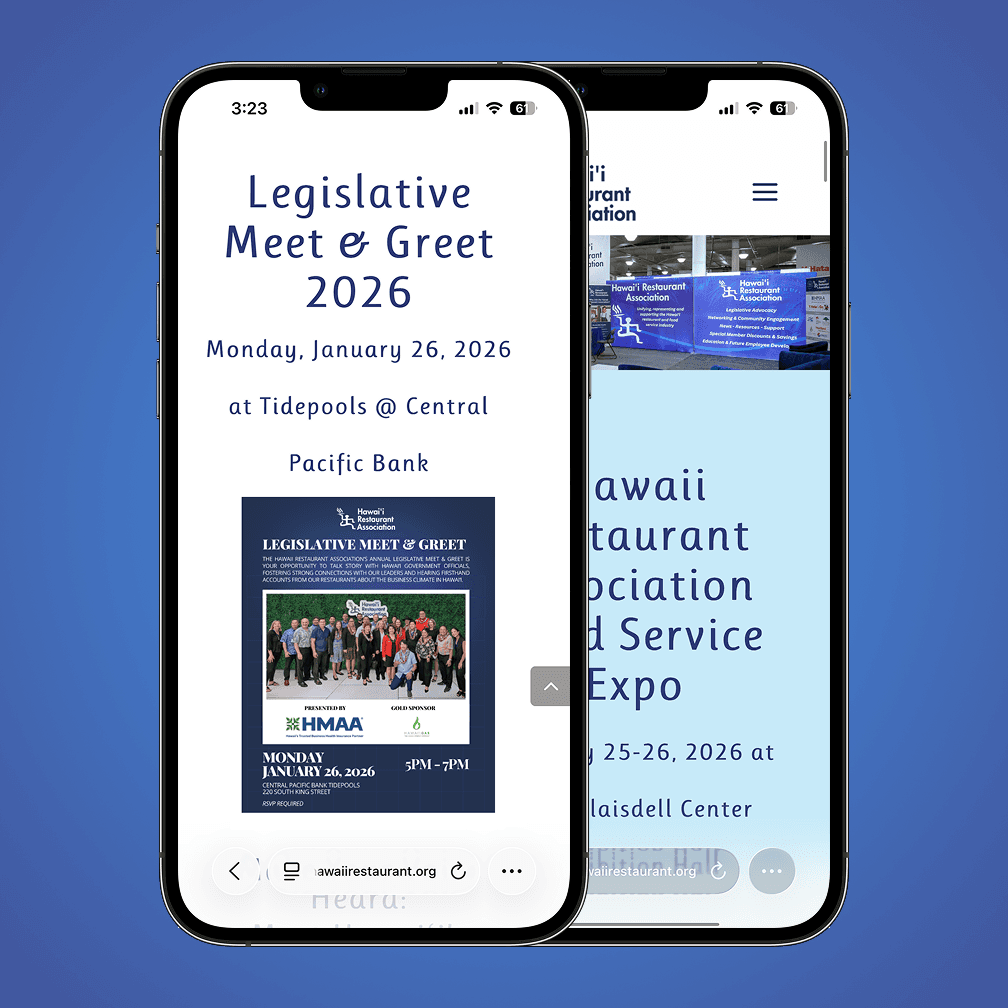
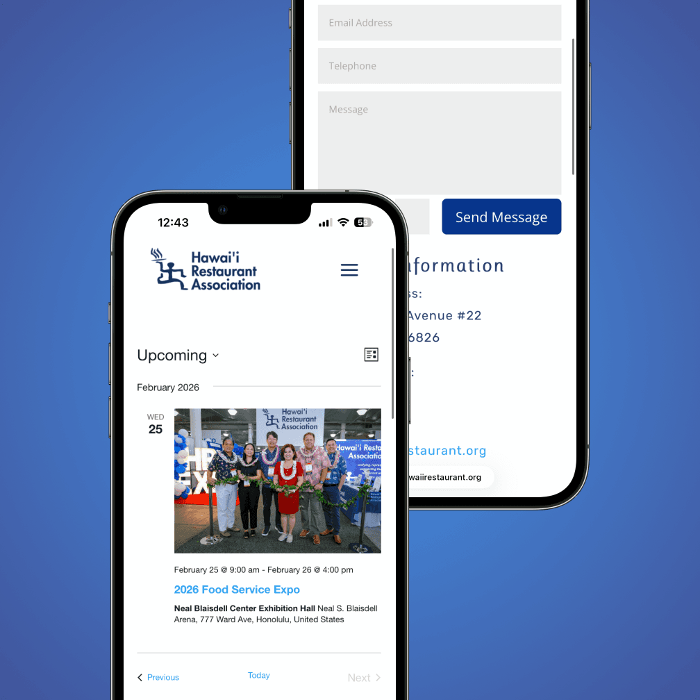
✓ All external links open in a new tab & users stay on site ✓ Content reorganized by recency and importance ✓ Consistent spacing, layout, & easy to scan and navigate ✓ Animations added to buttons for a modern, polished feel ✓ Site now feels as authoritative as the org it represents
The Full Story
The Challenge
The Hawaii Restaurant Association is Hawaii's largest foodservice advocacy organization — representing over 4,000 restaurants, suppliers, and foodservice businesses statewide. Their website needed to match that scale. Instead it had disorganized content, broken navigation links that sent visitors off-site with no way back, and a visual presentation that didn't reflect the authority and credibility of the organization. For an org that relies on member trust and sponsor relationships, a site that looked unpolished was quietly working against them.
What I found
Navigation links that opened external pages in the same tab — so visitors who clicked anything left the site and didn't return. No clear content hierarchy, so the most important events and resources were buried. Inconsistent spacing throughout. The content itself was solid — it just wasn't organized in a way that made it easy to find or trust. A UX and content problem more than a design one.
What I found
Fixed all navigation links to open in a new tab — keeping users on the HRA site while still accessing external resources. Reorganized all content by recency and importance so the most relevant information was always front and center. Refined the layout for better scannability with consistent spacing and clear visual hierarchy. Added hover animations to buttons and links to bring the interaction quality up to modern standards. The result was a site that felt as authoritative as the 4,000+ member organization behind it.
The Result
The HRA team were thrilled. Members and sponsors can now find what they need quickly. Events and media are clearly showcased. External links no longer send visitors away permanently. The site now matches the credibility of Hawaii's largest foodservice advocacy organization.