
UX & UI Design
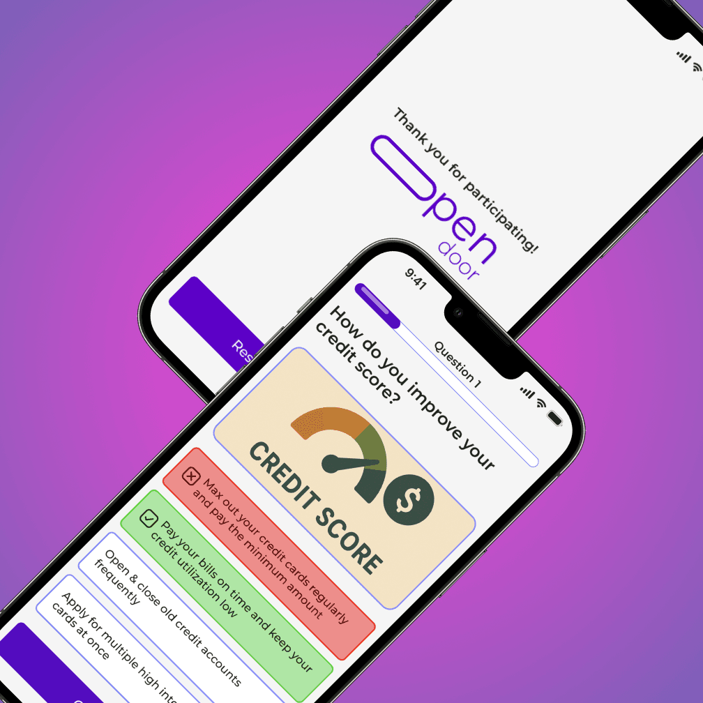
Our team built Open Door, a financial literacy app designed to help young adults, particularly first-generation Americans, navigate personal finance. First-generation Americans often face additional linguistic, cultural, and support-related barriers that contribute to lower financial understanding and poorer financial outcomes. Open Door was created to bridge that gap by making financial education more accessible, approachable, and fun.
Open Door
UX & UI Design
48hrs
Talking & planning
Live
Pitch presented to a panel of judges
Full UX
End-to-end design process under extreme time pressure
Here's what the design process looked like under a 48-hour constraint.
→ Joined the Open Door team at the pitch night kickoff → Target first-gen adults with no financial knowledge → Mapped the core user journey → Started wireframing the key screens
✓ Full wireframe set completed and approved by the team ✓ Interactive prototype built and click-through ready ✓ Micro-animations added to bring the experience to life ✓ Full developer handoff package prepared for the build team
The Full Story
The Challenge
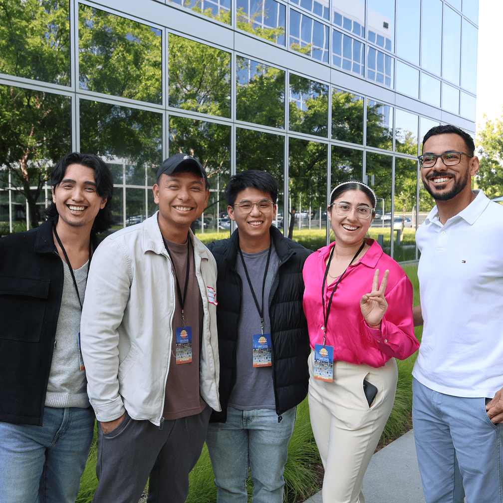
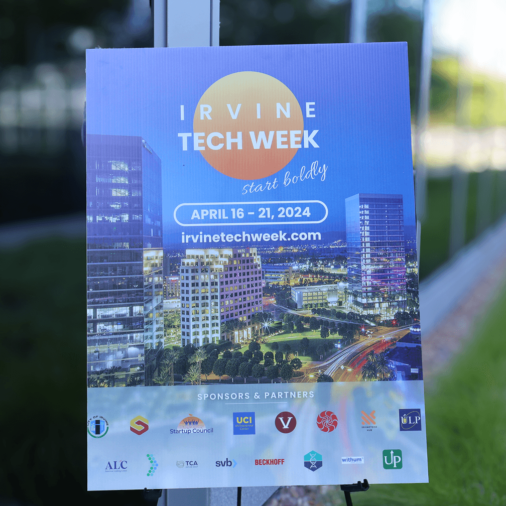
At the pitch night, entrepreneurs showed up with ideas and designers and developers jumped in to help build them. I joined the Open Door team and took on the full UX design scope — understanding the user, mapping their journey, designing every screen, and handing it off to the developers — all within the 48-hour window. The format forces clarity. No weeks of back-and-forth. Just the most important decisions made fast.
How it worked
At the pitch night, entrepreneurs showed up with ideas and designers and developers jumped in to help build them. I joined the Open Door team and took on the full UX design scope — understanding the user, mapping their journey, designing every screen, and handing it off to the developers — all within the 48-hour window. The format forces clarity. No weeks of back-and-forth. Just the most important decisions made fast.
How it worked
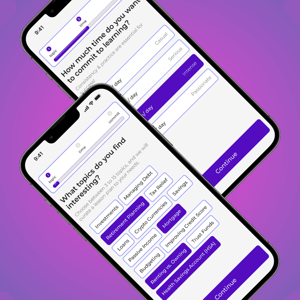
Wireframes that mapped the core user journey — onboarding, financial concept modules, progress tracking. An interactive prototype that let judges and team members click through the experience before a single line of code was written. Micro-animations that made the interface feel approachable, which mattered a lot for an audience that might already feel intimidated by financial topics. A full developer handoff with specs, flows, and assets ready to build from.
The Result
The product was pitched to a panel of judges at the end of the hackathon. We didn't take the top prize — but the design held up under pressure and the team had a working, presentable prototype in under two days. That's what mattered. A working prototype in 48 hours is harder than it sounds, and the process proved that good UX doesn't require months of iteration to be effective.